First Black and White Couple to Get Married
Interracial Marriage in the United States (1850–2017)
How the love of one family changed everything.
![]()

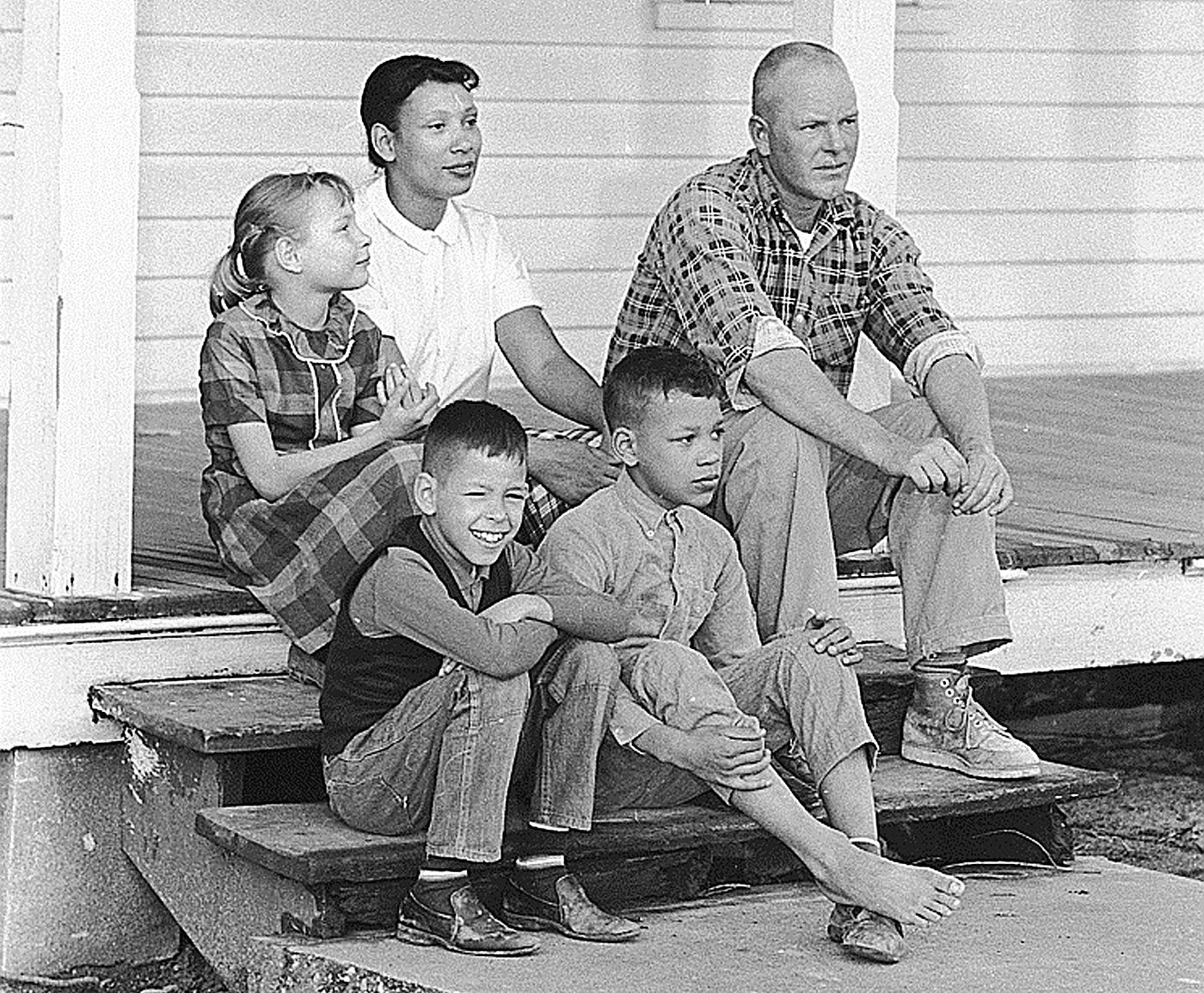
Lawyers Philip J. Hirschkop and Bernie Cohen asked Richard Loving what he [Loving] wanted the lawyers to tell the court as they presented their case for Loving vs. The State of Virginia. He responded,
"Tell the court I love my wife."
What happened next is the Loving Decision that deemed bans on interracial marriages that existed in sixteen states to be illegal, nationally.
This case has always interested me. Aside fr o m its obvious reasons — that the states shouldn't have any kind of a say in racial purity (their former reasoning) and who should and shouldn't get married, I also appreciate the Lovings as individuals — two rather soft-spoken people who took a stand for their marriage. And it was because of them that I was able to marry my husband in Maryland.
The Issue
During the fall semester of 2019, I was enrolled at the University of Maryland, College Park's course INST760 — Data Visualization, taught by Dr. Niklas Elmqvist. (Please take a look at my wonderful classmates' work here). We were assigned a course project and I wanted to look at trends in interracial marriages over time, see where these families lived and what kinds of racial combinations existed. Many of the laws that existed in the United States pertained directly to white women marrying African Americans or American Indians but I wanted to look beyond those two combinations. What about Asians and African Americans, for example? Luckily, I was able to access anonymized Public Use Microdata Samples (PUMS), going as far back as 1850.
In the documentary The Loving Story , both Richard and Mildred knew of couples who lived near them, were legally married and were of different races (Buirski, 2011). Was this captured in Census records? In short, yes. Gullickson stated in the paper Black-White Interracial Marriage Trends, 1850–2000, "many mixed race couples simply lived as husband and wife without the consent of the state…while less common than today, [marriage between Blacks and whites was not as rare as might be expected." (Gullickson, 2006) Evidence of this exists in a cursory analysis of the census records from 1850, where there were 75 interracial couples living in 23 different states.
Initial Goals
My initial goals were massive — I wanted to get a full scope of where these couples lived, how much education they gained and what they did for a living and I didn't quite take into consideration how much data analysis would be involved in the initial scope. I did know, however, that my main focus was going to be the racial combinations, where they lived and contrasting it with their state's anti-miscegenation laws.
The Data
Data were extracted from the IPUMS website from the University of Minnesota. Their data documentation provided insight about what data were available during any given Census or American Community Survey (ACS). Unfortunately, I was not able to get all variables for all Census'. This source had county-level data but not for every Census (1950 and 1970) so I kept this visualization at the state level. This was disappointing to find because the Pew report states that many of these couples, recently, tended to live in cities and I wanted to see if my data agreed with that.
Most of these data are 1% weighted samples. If I were to say that there were 100 interracial marriages Benton County, Minnesota in 1940, that wouldn't give the whole picture without knowing how many marriages, regardless of race, were present in that county at the time. Because of that, I'm presenting my data in proportions in order to provide more of a context for the users.
Users may notice see a gap in the data for the census year 1890. That gap was because of a fire in the Commerce Department Building in 1921. For more information, go to: https://www.archives.gov/publications/prologue/1996/spring/1890-census-1.html
Literature Review
One of the more significant works on interracial marriage is the Pew Study entitled, "Intermarriage in the U.S. 50 Years After Loving v. Virginia ." It outlines the growing trend of interracial marriage in the United States since Loving. Studies like these inspired me to dig deeper into the data, which could explain why I wanted to get extra variables like occupation and educational attainment. I then realized that, since I'm going as far back as 1850, (when these studies typically started at around 1960) sticking to location and racial makeup could make for some interesting findings.
Contrasting the Pew report, I read a critique of it by Oliver Wang. He brings to light that this report doesn't:
- follow dating patterns, which can be more indicative of a changing society,
- give any light to same-sex marriages, or
- elaborate on "ethnicity".
It would have been incredibly interesting to track dating patterns for 167 years for the entire country but that simply wouldn't have been possible. I was primarily interested in marriages. But I did want to include data on same-sex couples. After some research and data analysis, I was able to see married couples listed in the Census as early as 1980.
The Pew study listed people by ethnicity first then race and when I mentioned ethnicity, it was only one — Hispanic. If someone identified themselves as Black and Hispanic, they would be categorized as Hispanic. I understand that this is what the Census does but it wasn't something I wanted to do. This was, essentially, absorbing a part of a person's identity into another so I decided to include both — one can be both African American and Hispanic.
Finally, I noticed that there was a difference between the source data in much of the literature I reviewed. Some concentrated their efforts in looking at the marriage licenses of a smaller area for a shorter period. Many couples in states with anti-miscegenation laws would go elsewhere to get married and then live in their original state. This was a very common thing for couples to do. In reviewing these studies, I noticed that courts captured a great deal of detail on the people getting married. That would have been an interesting analysis if I wanted to go that route but, as previously mentioned, I wanted to concentrate on where people lived and I wanted to keep the scope of inquiry to be the whole United States.
The Design
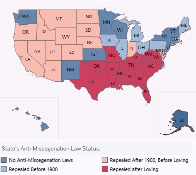
One of the more interesting bits of information from this project was the breakdown of states by their laws on interracial marrying. Maryland was the first colony to outlaw marriages between "freeborn English women… with Negro slaves." On a more positive note, there were nine states that never had anti-miscegenation laws before they became states! (For more information on the history of interracial marriages, please go to https://www.thoughtco.com/interracial-marriage-laws-721611.)
Keeping this in mind, I wanted to construct this map for my visualization:

Initially I had an idea to make two dashboards with different levels of specificity. One would be more general — if a person who identifies as Black and Chinese, they would be considered "Mixed" in the general dashboard and, in the more detailed one, they would be able to pick from the over 250 racial categories the Census has, as of 2017. I made attempts to make this but it appeared too visually overwhelming in Tableau. There wasn't a "type-in" and wildcard so the users would either have to read through a 252-option list or know that it is Chinese & African American not African American & Chinese.
I was rather disappointed in this discovery because even if it weren't considered interracial, I know that there are people, from researchers to comedians like Ali Wong, who would want to see data on inter-Asian marriages, for example. Not only was the design of this list of hundreds of different races and combinations of races difficult, there was also the issue of the United States collecting data like these only since 2000 and, given my time frame, I had only two Census' and one ACS from 2017 and these "trends" didn't show much.
And now I would like to give advice to people who are trying to create a dashboard for the first time in Tableau. For my data visualization, I initially found it difficult to construct some of the features I wanted to make for my dashboard because Tableau wasn't as intuitive as I had thought.
Please, Everyone — Use Tableau Public !
This website has been such an invaluable resource for me because it provides clear examples of what I want to do even if the topic had nothing to do with marriage, US history or the Census. If I came across a dashboard with a feature I wanted, I downloaded it and learned a great deal from it concerning how to construct the features I wanted. (example: drop-down lists and having the visualization change with the selections made) One display, in particular, has helped me was this one on presidential approval ratings over time. This visualization had many features I want in my dashboard and its source data characteristics that were in my data as well. There are gaps in the source data as there are in mine. This dashboard had the ability for the user to compare two different presidents and compare the ratings over time and I wanted something similar in my dashboard, only I wanted users to be able to pick two races and see marriage rates between the two selected races over time.
Insights
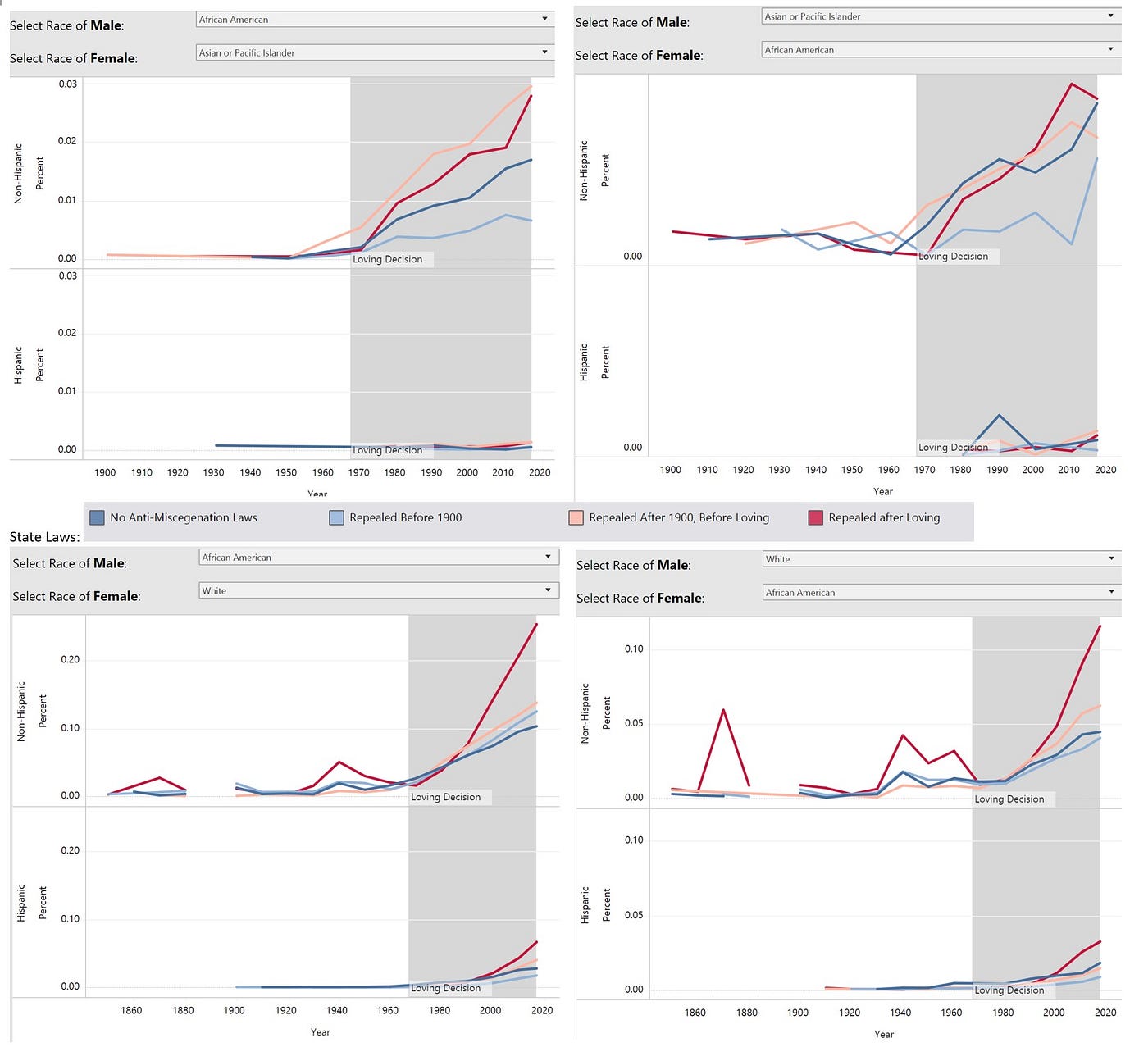
I was expecting there to be an increase in the percentages of interracial marriages after the Loving case but I didn't think it would be this drastic:

One interesting insight I've seen with this analysis is that interracial marriages are more prevalent in areas where it was outlawed for the longest time.
I was pleased that I was able to track same-sex marriages for my analysis but, for this part of the visualization, I put less of an emphasis on whether or not a couple was endogamous or interracial because same-sex marriages have only been legal in the United States for less than five years. The states' anti-miscegenation laws are not relevant to the discussion of same-sex marriage but I wanted to keep the classifications consistent.
For both straight and same-sex marriages, my findings show that the group of people most likely to intermarry tend to be Asians, which is consistent with Pew's findings.
Version 2.0
I thoroughly enjoyed researching and visualizing this topic so there will actually be a Version 2.0. For this version, I will look at ways of having more detailed races — maybe not have every single race but I'll certainly look into ways of having more groups. Additionally, data are available on the IPUMS site for every year of American Community Surveys from 2000–2017. I believe adding more surveys would aid in showing more trends with same-sex marriages. I would also look into ways to incorporate a visualization in a tooltip to show educational attainment.
The visualization can be found here.
References
Buirski, N. (Producer), & Buirski, N. (Director). (2011). The Loving Story [Documentary]. United States: Augusta Films
Gullickson, A. (2006). Black/White Interracial Marriage Trends, 1850–2000. Journal of Family History, 31(3), 289–312. doi: 10.1177/0363199006288393
Min, P. G., & Kim, C. (2009). Patterns of Intermarriages and Cross-Generational In-Marriages among Native-Born Asian Americans. International Migration Review, 43(3), 447–470. doi: 10.1111/j.1747–7379.2009.00773.x
Pew Research Center. (2017). Intermarriage in the U.S. 50 Years After Loving v. Virginia. Retrieved from http://assets.pewresearch.org/wp-content/uploads/sites/3/2017/05/19102233/Intermarriage-May-2017-Full-Report.pdf
Stir It Up: Race and Newlywed Marriages, Oliver Wang — https://www.theatlantic.com/national/archive/2010/08/stir-it-up-race-and-newlywed-marriages/61139/
First Black and White Couple to Get Married
Source: https://towardsdatascience.com/interracial-marriage-in-the-united-states-1850-2017-d6dfc3678e07